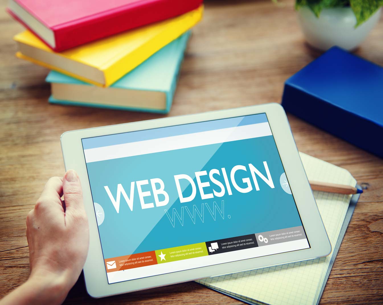
Top Web Design Trends to Watch Out For In 2016
Be it fashion, art or music, trends come and go with time. When it comes to web development, the remarkable array of possibilities brings out new trends very often. There was a time when GIFs dominated most websites. Today, a responsive and sleek web design is more in vogue. What may have worked for you five years back, will no longer hold the same appeal to users. To stay connected and gain an edge over the competition, it is necessary to be more in tune with what’s trending.
If you’ve failed to update your web design, then now is the right time to do so. Let’s take a look at the top web design trends in 2016 that you can incorporate into your website:
1. Vertical Patterns and Scrolling
With mobile traffic almost equaling desktop traffic, vertical interfaces and more scrolling which was waved goodbye for good by most web developers is now back with a bang.
2. Almost-Flat Design
An improvement upon the flat design, the almost-flat design retains the stripped off look of the former, while adding depth and dimension to achieve a more elegant look.
3. Card-Style Interfaces
If you’re aiming for a user-friendly web experience, a card-style interface may just be your thing. The idea is to present a burst of information in the most eye-catching manner possible. From embedding videos to stunning imagery, there’s just so much you can do with it.
4. Hand-Drawn Illustrations
How do you connect with users on a personal level? Hand-drawn illustrations are the answer. Besides adding more personality they give the website a quirky and friendly vibe that is sure to resonate with users.5. Static Images
Kick off the boring monochromatic look, since 2016 is all about amping up the style quotient. Add a few high-quality background images to spice up your web page.
6. Interactive Storytelling
Who doesn’t love a bit of an adventure and a dash of mystery? Spike up a visitor’s interest with an interactive interface that tells your story in the most creative way possible.
7. The Minimalistic Approach
“Loading.. Please wait” That’s one way you can drive off a page visitor. Don’t overload graphics and end up annoying a visitor. Simplicity is in!
8. Beautiful Typography
Let your website be the pinnacle of elegance by opting for big and bold typefaces. If it’s done right, it can breathe life into your text content.
9. Hamburgers and More
From the infamous hamburger icon to oversized animated images, iconography is the next big thing when it comes to achieving a neat and minimalistic look.


no responses.